Intuitive Watercolour Painting Instructions by Chris Marin
“… the intuition is the walkie-talkie between the personality and the soul.” Gary Zukov
- Choose one yellow, one red and one blue watercolour … your favourites at the time. I like to add gold or silver gouache to one of the colours because it comes through as a shimmer when dry. You can substitute some watercolours for gouache (opaque). If you want to use a waxed candle, rubber cement, self-levelling gel or masking tape as a resist, do so when paper is still dry. Write colour names and brands, your name and date on the back.
- Squeeze small amount of paint into Dixie Cup and add a little water (1/3 cup maybe).
- Stir with brush or stir stick.
- Wet watercolour paper front and back with sponge.
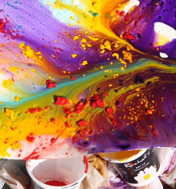
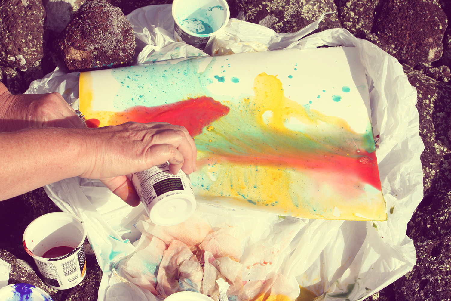
- Pour from cup, splatter from brush, drip from spoon, shoot from dropper or syringe the yellow, red and blue in that order.
I love to throw on a Pearlescent Ink or fluid acrylic watered down in any colour – white is amazing – if acrylic used, try Flow Release diluted with water. - Tilt paper a little to let colours run together. Spritz with water and /or rubbing alcohol.
- And/or lay stretch wrap or waxed paper on top (in areas or all over).
- Knead the layered paper with fingertips or palms to move paint around. You can place stones, jewellery, photos, etc. on top of covered paper if you wish.
- Let dry. Use hairdryer or put out in sun if you must speed up process. Remove covering and salt. If ink or acrylic on painting, then do not let it dry completely before removing papers on top.
- Look at painting in all lights and angles.
- When you find shapes, outline lightly with lead pencil and then use fine marker or coloured pencil.
- Glaze into background with transparent blue like Indigo, Prussian or Manganese or use coloured pencils, watersoluble crayons or pastels.
- If interested, look up shapes like animals, symbols, etc. in books like “Animal Speak”, “Women’s Dictionary of Symbols”, etc.


SUPPLIES (these are for experimentation – you don’t need everything at once)
- 300 lb. Arches or Fabriano watercolour paper, cold pressed (rough) or hot pressed (smooth). Try 140 lb. Winsor Newton or Woolfitt’s mystery paper.
- Different watercolours in yellow, red, blue from Holbein, Winsor Newton, Lukas – especially like Da Vinci because it is less expensive, but good quality.
- Suggested triads – {helio, Lukas genuine rose, Holbein peacock or turquoise}, {raw sienna, burnt sienna or Holbein brown madder, Prussian}, {cadmium yellow, alizarin, cerulean}, {Holbein Naples yellow, permanent red, ultramarine blue}, {Da Vinci aureolin yellow, red rose deep, manganese}
New favourite colours – Lukas Caput Mortuum Deep & Caput Mortuum Violet - For glazing – transparent blue watercolours like Prussian, Indigo, Manganese Gouache in silver and gold and other colours, fluid acrylics in white and other colours
- Watercolour mediums like Granulation, Texture and Iridescent
- Pearlescent FW inks and other inks, Flow Release if using acrylic
- #10 watercolour brush (my favourite is ½ inch flat with Lucite handle), 2B pencil
- Coloured pencils, permanent, fine tip or metallic markers (pilot), watersoluble crayons
- Pickling, table, sea salts, stretch wrap, waxed paper, aluminum oven liners to transport
- Paper towels, Dixie cups, sponge, spritz bottle, rubbing alcohol, tubs for water
